By Jacqualyn Gile

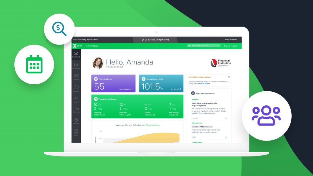
We’re excited to introduce a brand new dashboard to your BalancedComp experience—one that’s as gorgeous as it is smart.
BalancedComp’s salary administration app is known across the financial industry for its ease of use, delightful experience, and pinpoint accuracy. Now with Hyperion, our latest version, it’s gotten even better.
Insights over data
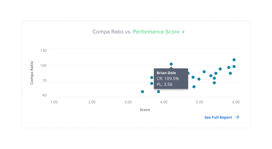
“We make data work for people” is a phrase we’ve tried to embody. Our previous dashboard did an excellent job of showing clients a static overview of their data. And data is good, right? It’s one of your company’s most valuable assets. While having access to data is important, with our new Hyperion dashboard, we wanted to help our clients understand their data. We wanted them to immediately recognize areas of strength and weakness, rather than interpret them. That’s why we focused on delivering insights. We’ve introduced new data slices, as well as interactive graphs that visually identify unspoken internal trends.
The Average Date in Position graph quickly highlights how experience and job classification correlates with compensation at your organization.

Our interactive scatter plot illustrates any unspoken correlation between compensation and experience or performance levels.

Meaningful guidance and communication
We use web applications every day, just like you. Many of them suffer from two common pitfalls:
- Data can quietly become outdated. That’s why we’ve added prompts that alert you when it’s time to update your system.
- It isn’t easy to know whether you’re taking full advantage of everything a system has to offer. Has something changed? Has a new feature been released? We don’t want to leave you guessing. To sidestep these worries, we’ve bolstered our News & Announcements section, while simultaneously keeping it out of your way if you’re in the app and on a mission.
We all know that people are attracted to a pretty face, but it’s what’s inside that counts. By delivering impact to your bottom line and providing real-time guidance, our new dashboard will fill the gaps when it comes to interpreting your data.
Schedule a demo to see it in action!
Back to Blog

